
In modern times, food brands finally stopped hiding information on their packaging. The opposite, companies producing healthy products are proud of the ingredients they use. And, naturally, they want to communicate that to the world. Consequently, many businesses tend to highlight the number of certain vitamins and minerals or the caloric value of each product. In 2019, the visual emphasis put on the nutritious value could be identified as the biggest graphic design trend in the healthy food industry. But where does this come from?
Of course, the reason for any changes in the market and packaging design practices is the changing customer behavior. Nowadays, customers become more and more aware of the nutrients they consume. But the trend isn’t new, it is growing already for quite a few years. Nevertheless, such consumers search for nutritious information on the packaging of the products. The more they need to search for it, the more discouraged they become. So, suddenly, easy access to the ingredients list turned to be today’s decisive purchasing factor.
Minimalism is a trend present across many industries, not only graphic design. Quite naturally, it also reached the healthy food producers. How is it implemented? The first noticeable element is the popular use of a white background. White space is technically called negative space. Overuse of it is risky as it may resemble a partially unfinished design. However, the correct balance between the white background and decorative elements can illustrate purity – a symbol health-conscious customer search for.
In the food industry, however, minimalism stands for a little more than simply the mentioned purity and nice aesthetics. Everyone’s daily food choices and, therefore, daily food packaging choices, to a certain extent influence the customer’s personal identity. Food is more than a purchased object since the purpose of buying it is to consume it. Such decisions somewhat reflect our beliefs and values. Since the general population slowly becomes more food conscious and decides to give higher priority to a healthy life, the adopted view often goes ‘less is more’. Naturally, the smaller the number of harmful ingredients, the better, the more organic and generally healthier. Minimalistic design adequately translates what’s inside the package to the customer with the ‘less is more’ motto.
‘Creativity has become a basic need’ is a statement made by ForoAlfa on the subject of food packaging design trends. Creativity generates original designs. And originality is currently extremely important, especially since the moment the food market got saturated. Customers can find pretty much everything they need or want, with multiple substitutes available.
Many businesses turn to packaging design as the last option they can work on to differentiate themselves among the many competitors. Partly because the ingredients and taste are somewhat similar and difficult to distinguish for a standard customer. And partly because, when faced in front of 5 tomato sauces, how will one choose which one to pick? Assuming that he or she hasn’t tried any one of them before, the person will most likely base its decision on factors such as the look and the price.
In the past, ‘light’ products weren’t attractive whatsoever. Why? Well, light products such as fat-free yogurts or sugar-free cereals were originally created for people who couldn’t eat the standard options. The customers were either on obligatory or voluntary strict dietary restrictions. These items were simply versions of normal products. What followed was the design of their packaging. While the normal version of yogurt has strawberries and some greenery on a pink background, the healthier version has strawberries on a white background. In comparison, it looked less attractive. It reflected a feeling that consuming the yogurt would be sort of like deprivation of the enjoyment of eating the ‘real’ version.
With the mentioned changing customer behavior, the demand for these products grew. Not only the companies who produce the light versions started to target a wider audience, but also new brands emerged who devoted themselves to the health-conscious consumers. These businesses knew that although there is a demand for them, the risk of being perceived as a brand depriving the customer of food enjoyment is still existing. The message they wanted to send through their products was and still is: eat it without guilt.
As a result, these companies started to heavily work on charming and engaging packaging designs. They wanted their bags, boxes, and labels to say that the inside of it is delicious, tasty and will only bring positives. Moreover, healthy food brands are aware that the choices done by their customers are driven by the food contributing to their personal identities. Hence, they try to make the products look as if they contribute to the overall lifestyle. In other words, the graphic design of healthy brands goes beyond the ingredients.
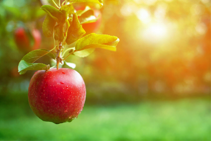
Some time ago, food brands would try to sell a product by advertising what the company aspired it to be. Let’s take a popular example of an apple juice. A company, operating a few years ago, would show a perfectly round and shiny apple on its box or bottle. Customers loved the idea that such perfect ingredients reach their tummies. Nowadays, however, consumers are a little more skeptical whether their juice is really made of such ideal apples. Is that even possible?
Why did customers grow into being so doubtful? Likely because of media and the internet showing what happens backstage of massive food productions. Perhaps it takes only one article about one bad apple used to make their favorite juice and the idea of perfection in a box or bottle is crashed. Many brands, especially healthy ones that only start to establish themselves on the market, are aware that this is a risk they cannot take. With free access to information, one mention of a bad apple can ruin their business before the juice makes it to the big supermarket shelf.
Consequently, emerging healthy food brands decided to take a different approach. Instead of showing an ideal apple, they will present the beauty of an imperfect but real fruit. They no longer want to sell something they are not or something they do not stand for. And customers seem to appreciate it. Moreover, showing imperfection is an act of honesty. A noble characteristic which consumers want to be associated with. In short, authenticity wins over perfection.
Graphic design is a little more than only illustrations and colors. It also has a lot to do with words. The choice of words is normally made by the marketing department, not the designer, but nevertheless, it is worth mentioning to get a bigger picture of the industry trends. What designers do is make the decision of the appropriate fonts and the placement of those words.
Healthy food companies often try to reach their customers and sell their products through ‘verbal branding’. Popular 2019 trend is the use of playful words or plays of words. Informal phrases allow the companies to talk to the consumers on a personal and friendly-like level. In general, such brands try to avoid being serious. Their creations, very often, were a result of the founder’s passion for food rather than an attempt to fill in a market gap.
Other than playful words, how do brands try to show their passion for healthy food? There are a few strictly visual trends. One is the use of bright and pastel colors, often incorporated into the packaging designs of snacks like chocolate. Other brands use abstract features. Either through colors or doodles. This is especially popular in the healthy beverage industry. Last but not least, some businesses decide to go with contrasting colors with big slogans. This trend, however, slowly begins to be outdated.
Although this article is about graphic design trends, there is a lot of mentioning of packaging design which goes beyond visuals. Materials used for any sort of food packaging are nowadays not only chosen and developed for the sake of convenience but also marketing and advertising purposes as well as to transmit the company values.
One noticeable trend is the more and more common use of abstract packaging shapes. Although not often seen in the supermarkets due to convenience, there are a lot of brands that incorporate them. You could have come across them, for example, in a local and artsier food shops. Or perhaps you read an article online on the latest clever food boxes.
Another trend is the use of sustainable materials. The world finally becomes aware of environmental problems. And many people realize that the food industry had and has a big influence on the current state of pollution. The best evidence is the rising number of vegans and vegetarians. Moreover, brands know about the big concerns of aspects such as the use and or bans of plastics and try to adapt. Young healthy food brands rarely enter the market with products packed in plastic. The opposite, they include sustainable packaging in their business plans hoping that is will potentially become one of their selling points. Some also include the information on where they source their raw materials on the bags itself and inspire customers to follow the trend and care for the planet.
 Why Full Body MRI Scans Are Changing Preventative Health
 Sprouts May Help Fight AMD
 5 Foods to Avoid if You have Eczema
 Treating DOMS aka Muscle Fever
 Benefits of Using Skin Toner
 Body Dysmorphia: A Growing Concern
  Achieve Your Fitness Goals Like a Pro with the Best Fitness Benches
 Finding the Best Countertop Water Filter for Safe and Clean Drinking Water!
 Climate Change Skin Defense
 4 Natural Ways to Prevent Cataracts